All Things ODD · Visual guidelines · 1.0
Visual guidelines. Everything ODD looks like, written down.
This is the visual system underneath everything ODD makes — measured from what ODD has already built rather than invented for a brand book. The website is the source of truth; these twenty chapters formalise it, so the same identity can carry a deck, a poster, a room or the next product without being redesigned.
All Things ODD
IndexODD is the masterbrand. All Things ODD is the house it lives in.
ODD is a Helsinki-born initiative working to strengthen creative and cultural work and bring its expertise closer to business and wider society: ODDfest, Helsinki’s creative week; ODDference, a business conference powered by creative and cultural expertise; ODDspace, a year-round workspace, studios and event space in Vallila; and project work with organisations. It is operated by New Nordic Way rf, a Finnish non-profit association.
This book is the visual operating system for everything ODD makes — the website, decks, reports, proposals, social posts, posters, invitations and rooms. It is not a rebrand. It formalises what the website already does, removes what was accidental, and writes down the rules so that the next person — or the next AI agent — can make something new that still looks like ODD.
- Source of truth
- The website’s design tokens (
src/styles/). If this book and the site ever disagree, the site is right and the book is out of date. - For designers
- Chapters 02–16, and the files in Downloads.
- For code and AI
brand/BRAND-GUIDE.mdandbrand/tokens/brand-tokens.jsonin the repository — the same rules, written to be followed.- For decks
- Chapter 17: an editable PowerPoint template and an example.
- Version
- 1.0 · September 2026
Brand idea
IndexODD does not make the culture. It builds what is around it.
Every part of ODD is a structure around creative life: a week around independent events, a room around an argument, a building around daily work. The website says it in one line — “Finland has creative talent. What’s missing are the structures that help it grow, connect and last.”
The visual system does the same thing. It is a precise, quiet frame — Ink, hairline rules, numbered cells, a functional sans, small tracked labels — built around something alive: photographs of real nights, statements in a rounded display face, a mark that steams, warmth where you touch. The frame is institutional on purpose. What it holds is not. That is why ODD can sit next to a museum, a club night and a board meeting without changing its clothes.
Tension, held in one system
| Tension | The frame | What it holds |
|---|---|---|
| Structure × chaos | A hairline grid | the archive mosaic panning and swapping inside it |
| Institution × underground | Catalogue numbering, centred section heads | club-night photography, film grain |
| Business × art | Signal, the lighting desk’s blue | Ember, the warm stage light |
| Intelligence × play | Premise-then-point headlines | Forta’s rounded capitals, the hand-drawn cursor |
| Precision × improvisation | Measured tokens, one owner per gap | steam on the mark, warping type |
| Digital × physical | A sticky nav, fluid type | grain, photographs of rooms, signage |
| Established × emerging | 5,000+ participants, every maker named | “still taking shape”, “a pilot” |
The working test. When a layout feels flat, add life inside the frame: a real photograph, a statement, heat. When it feels chaotic, strengthen the frame: align it to the grid, rule it, number it. Never fix either one with decoration.
Design principles
IndexSeven rules a designer can actually use.
- 01
Build around, do not decorate.
What it meansEvery structure holds something real. A grid holds photographs, a cell holds a number or a name, a rule separates two things that are different.
How it showsHairline grids with numbered cells. One photograph in a grid of labelled cells. A centred section title over a hairline.
AvoidOrnament, borders around nothing, pattern backgrounds, a grid drawn for its own sake.
- 02
Evidence, not illustration.
What it meansShow that it happened. Real photographs, real names, real counts — the archive is the brand’s best asset.
How it showsThe archive mosaic. A credits roll of every name. Figures with labels. Captions that name the venue.
AvoidStock photography, generated people, icons standing in for photographs, numbers without a source, “world-class”.
- 03
Two lights on one ground.
What it meansInk is the room with the lights down; Paper is the house lights. Ember and Signal are light, not paint.
How it showsAn accent only as label text, a keyline, a wash over a photograph, or the heat something warms to when touched.
AvoidAccent-coloured sections, gradients, a third accent, Ember and Signal side by side for decoration.
- 04
Say it loud, explain it quietly.
What it meansForta states, Gabarito explains. One statement per surface, written as a sentence.
How it showsA short Forta sentence ending in a full stop. The premise in quiet grey, the point in full. A small tracked label above, Body below.
AvoidForta paragraphs, typed capitals, a sixth type size, two statements competing.
- 05
Round is for what you touch.
What it meansThe pill comes from the mark’s three lobes. Things you press or that label something small are round; everything that holds content is square.
How it showsButtons, tags and badges are pills. Photographs, cards, cells, tables and bands are square. Floating panels take 10px.
AvoidRounded photographs or cards, circles as decoration, square buttons.
- 06
Alive, in small doses.
What it meansA living layer moves over the structure: steam on the mark, film grain, drifting rails, warping type, the hand-drawn cursor, heat.
How it showsOne living thing per view, always with a still version for reduced motion.
AvoidAnimation that hides content, scroll-jacking, parallax text, effects on everything.
- 07
Creative first, business invited.
What it meansODD is a creative organisation that business is invited into — never the reverse.
How it showsThe creative column first (left, or above), business second. Ember before Signal. ODDfest before ODDference.
AvoidCorporate-first ordering; business language setting the tone of a creative page.
Logo
IndexThree lobes that read ODD. The only drawn thing in the whole system.
Everything else here is type, rule and photograph. The mark is the exception: one continuous path, three fused lobes, no version with a strapline and no second logo. Its proportions are fixed at 434.41 × 137.892 (3.15:1). Scale it, place it, choose Paper or Ink artwork — that is the whole set of decisions.


Clear space and minimum size
 Lockup, minimum 16px tall (6mm in print)
The lockup, constructed
A product lockup is the mark plus its suffix in Forta — nothing else. Four numbers, all in units of the mark’s height, produce every one of them, which is why a new name never needs a new drawing. The guides below sit on the real ODDfest artwork.

- Suffix cap height
- 0.484 × the mark’s height
- Baseline
- 0.7398 × the mark’s height, from the top
- Mark to suffix
- 0.2709 × the mark’s height, measured origin to origin — the sidebearings do the optical work
- Tracking
- 0.09em, with Forta’s own kerning left on
- Generated by
python3 brand/logos/build.py— add a name toLOCKUPSand it exists
Backgrounds



Misuse
The living mark, and the small mark

Brand architecture
IndexOne mark, one suffix. No sub-brand ever gets a logo of its own.
ODD is the masterbrand and the only mark. A product is that mark with its name completed in Forta — so the family reads as one thing at a glance, and a new name costs a script run rather than an identity project. “All Things ODD” is the name of the house: the website, this book, the publisher line on a deck. It never replaces ODD in running copy.
All Things ODD — the umbrella. Operated by New Nordic Way rf, Helsinki.

Helsinki’s creative week of independently made events.
Ink

A business conference powered by creative expertise.
Ink

A year-round workspace, studios and event space in Vallila.
Paper — the whole page inverts

The recording studio inside ODDspace.

Project work with organisations, under Work with ODD.

Generated, not yet used — proof the system takes the next name without a redesign.
What never changes, what a product may choose
- The mark, and the four numbers that build a lockup.
- Forta and Gabarito, and the five-size ladder.
- The spacing system and the two container widths.
- Ink or Paper as the ground. Nothing else.
- Square for content, pill for what you touch.
- Photography as evidence: the archive, not stock.
- Which ground: Ink by default, Paper where the thing is daylight and physical.
- One accent, or none — Ember, Signal, or the Ultraviolet wash on ODDfest.
- Its hero: photo mosaic, film, or a single photograph.
- Its rail words: product · city · year.
- Its subject matter in photography.
- Its own copy, in the ODD voice.
Writing the names
- Correct
- ODD · ODDfest · ODDference · ODDspace · ODDstudio · ODDagency · Work with ODD · All Things ODD
- Never
- Oddfest · ODD Fest · ODDFest · odd fest · “the ODD Festival”. One word, ODD in capitals, the suffix lowercase.
- In Forta
- The face is unicase, so it capitalises for you. Write sentence case; never type in capitals.
- All Things ODD
- The site and publisher name —
og:site_name, this book, the back page of a deck. Not a replacement for ODD in a sentence. - New name
- ODD + one lowercase word, ideally under eight letters, that says what the thing is.
Adding the next one
- Name it:
ODD+ one lowercase word. - Add it to
LOCKUPSinbrand/logos/build.pyand run it. The lockup exists, in both colours, correct by construction. - Choose the ground: Ink unless the thing is daylight and physical, like ODDspace.
- Choose at most one accent — or none.
- Give it rail words: the product, the city, the year.
- Find its photographs. If it has none yet, borrow the archive; never buy stock.
- Design nothing else. Everything it needs already exists.
Colour
IndexTwo lights on one ground. Measured from 1,478 photographs, not chosen from a swatch book.
The palette is a census of the ODDfest Flickr archive: every public photograph, clustered and weighted by how much of the frame each colour actually occupied. Ink came back as the single most common colour at 32.7% — a rose-tinted near-black, the real colour of the rooms. Amber is the stage light, Signal the lighting desk’s blue. That is why the site looks like the events: it is literally made of them.
Keep the restraint. Two grounds, two accents, a handful of neutrals. A new colour needs the same kind of provenance — or an explicit, documented decision to depart.
--swatch-inkThe ground. The most common colour in 1,478 archive photographs (32.7% coverage): a rose-tinted near-black, never print black.--swatch-paperThe one light neutral. Figure on Ink; the ground of ODDspace and of inverse moments (menu, Ways to take part).--swatch-backstage-darkRaised surface on Ink: cards, bands, panels.--swatch-backstage-lightRaised surface on Paper (ODDspace).The two lights, and the quiet ones
--color-amberEmber, the warm stage light. Creative / ODDfest. A wash or keyline on Ink; text only on Paper.--color-amber-brightEmber as text on Ink (4.62:1). The creative voice label; the heat colour on Ink.--color-signalSignal, the lighting desk's cool blue. Business / ODDference. Washes, rules, form accents.--color-signal-brightSignal as text on Ink (4.83:1). The business voice label.--color-signal-deepSignal as a fill under Paper text (4.79:1): consent and system buttons.--color-ultravioletThe archive's rarest colour. A wash on ODDfest moments only, at most a 16% mix. Never a fill, never text.--color-indigoScrim tint under archive imagery. Never text, never a fill.--color-clayQuiet warm neutral. Large text or decoration only (4.32:1 on Ink).--color-clay-readClay as small text on Ink (5.23:1): the legal line.How much of a surface each one gets
Roles
Components never name a colour; they name a role. Each role is one CSS variable that already flips on ODDspace’s light ground, which is why the entire site inverts with a single class and no component knows about it.
| Role | Token | On Ink | On Paper | Use |
|---|---|---|---|---|
| Ground | --color-bg | #0E090B | #E2DFDE | Page background. |
| Ground Raised | --color-backstage | #232028 | #D3CDC9 | Cards, bands and panels one step off the page. |
| Figure | --color-paper | #E2DFDE | #0E090B | Headlines, primary text, solid buttons, the mark. |
| Figure Strong | --color-paper-80 | — | flips with the theme | Lead paragraphs: emphasis without size. |
| Figure Muted | --color-paper-60 | — | flips with the theme | Body copy under a headline; secondary text; captions. |
| Figure Quiet | --color-paper-40 | — | flips with the theme | Eyebrows, labels, meta, the quiet premise of a two-tone headline. The lowest step allowed for text. |
| Line Control | --color-paper-35 | — | flips with the theme | Border of an outline button. Not for text. |
| Rule Strong | --color-paper-20 | — | flips with the theme | Rules that must read at a glance; the underline of a text link. |
| Rule | --color-paper-12 | — | flips with the theme | Hairlines: section-head rules, grid lines, card borders, the nav edge. |
| Heat | --color-heat | #AE6855 | #9A432B | What anything pressable warms to on hover or press: links, rows, keylines of linked bands. |
| Voice Creative | --color-amber-bright | — | flips with the theme | The 'For creatives' label and creative-side accents. |
| Voice Business | --color-signal-bright | — | flips with the theme | The 'For business' label and business-side accents. |
| System Action | --color-signal-deep | — | flips with the theme | Fill of consent and system buttons that are not brand CTAs. |
| Legal | --color-clay-read | #967E79 | #6B5551 | Footer legal line and fine print. |
| Scrim | rgb(14 9 11 / N%) | — | flips with the theme | Over photographs under text. Always Ink, never #000: 45-82% at the text, 8-20% away from it. |
Pairings that are safe, and pairings that are not
| Text | On | Ratio | Good for |
|---|---|---|---|
| paper | ink | 14.91:1 | all text |
| paper | backstage | 12.11:1 | all text |
| ink | paper | 14.91:1 | all text |
| ink | backstageLight | 12.56:1 | all text |
| figureStrong (dark) | ink | 9.62:1 | all text |
| figureMuted (dark) | ink | 5.72:1 | all text |
| figureQuiet (dark) | ink | 4.99:1 | all text |
| figureQuiet (dark) | backstage | 4.64:1 | all text |
| figureMuted (light) | paper | 6.67:1 | all text |
| figureQuiet (light) | paper | 5.11:1 | all text |
| figureQuiet (light) | backstageLight | 4.79:1 | all text |
| amberBright | ink | 4.62:1 | all text |
| amber | paper | 4.93:1 | all text |
| signalBright | ink | 4.83:1 | all text |
| paper | signalDeep | 4.79:1 | all text |
| clayRead | ink | 5.23:1 | all text |
| amber | ink | 3.02:1 | large text and keylines only |
| signal | ink | 4.46:1 | large text only |
| paper | signal | 3.34:1 | large text only; use signalDeep behind small text |
| amberBright | paper | 3.23:1 | never as text; use amber |
| ultraviolet | ink | 2.97:1 | never as text |
Ratios are measured on the composited colour against its real background, not on the token’s face value — a translucent step reads differently on Ink than on a raised card. Compute it before shipping a new one.
Where colour does not go
- No coloured page or section backgrounds. Ground is Ink or Paper.
- No gradient except the Ink scrim that makes a photograph readable.
- No colour-coded categories, tags or charts by hue alone.
- No Ember on Paper as text, no Signal under Paper text — use the reading value of each.
- Ultraviolet is a wash on ODDfest, at most a 16% mix. It never becomes a fill.
- No heat as text on a raised card — 3.75:1 on Backstage. There the text goes to full figure and the underline or border carries the heat.
Typography
IndexTwelve jobs. Five sizes.
Two faces. Forta states: a soft, rounded, unicase display face whose lobes are the same shape as the mark — it renders as capitals whatever you type, so it can only ever sound like a statement. Gabarito explains: a clear geometric sans that carries every sentence, label, button and form field on the site. Both are SIL Open Font Licence, so they travel anywhere ODD does.
There are five sizes on the whole site and nothing below 14px. Everything a designer usually reaches for a sixth size to solve — a lead, a caption, a run-in title, a nav link — is solved here by face, weight, colour, case, tracking or position instead.
ABCDEFGHIJKLMNOPQRSTUVWXYZ 0123456789 ÄÖÅ & — → €
Forta Regular · display · SIL OFL 1.1 · unicase
Abcdefghijklmnopqrstuvwxyz 0123456789 ÄÖÅ & — → €
Gabarito 400 / 600 / 700 · body · SIL OFL 1.1
The ladder
--text-heroclamp(3.25rem, 6vw, 5.25rem)line-height 0.98 · tracking -0.02emdeck: 72ptOne week. Many hosts.
--text-displayclamp(2.125rem, 4vw, 3.25rem)line-height 1.04 · tracking -0.015emdeck: 48ptCreativity belongs closer to the centre.
--text-headingclamp(1.5rem, 2.4vw, 2rem)line-height 1.12 · tracking -0.01emdeck: 30ptDifferent problems need different structures.
--text-bodyclamp(1rem, calc(0.96rem + 0.2vw), 1.0625rem)line-height 1.55 · tracking normaldeck: 18ptODDfest is a week of independently made events across Helsinki. Artists, collectives, venues, organisations and companies make and produce their own.
--text-small0.875remline-height 1.4 · tracking normaldeck: 14ptODDfest 2026 · Vanha Ylioppilastalo · Photo: ODDfest
Twelve jobs, on five sizes
| Job | Size | Treatment |
|---|---|---|
| Display | Hero | Monumental. One per page or slide. |
| H1 | Display | Page or slide title. |
| H2 | Heading | Section title, centred over a hairline rule (.section-head). |
| H3 | Heading | Card and column titles. |
| H4 | Body | Forta at the Body size (session titles, names on photo cards), or Gabarito 600 at the Body size for a run-in title on its own paragraph. |
| Lead | Body | Body in figureStrong on a wider measure. Not a bigger size. |
| Body Large | — | Deliberately absent. Use lead, or promote to heading. |
| Body | Body | Gabarito 400. |
| Small | Small | Gabarito 400. |
| Label | Small | Eyebrow: Gabarito 600, uppercase, 0.16em tracking, figureQuiet. |
| Button | Small | Gabarito 600, uppercase, 0.05em tracking. |
| Navigation | Body | Forta at the Body size, 0.01em tracking, figure at 80%. |
| Caption | Small | Gabarito 400, sentence case, figureMuted. |
Premise, then point
Finland has creative talent. What’s missing are the structures that help it grow, connect and last.
Good and bad
What ODDfest is
One shared week, made by Helsinki’s creative communities.
Artists, collectives, venues, organisations and companies make and produce their own.
ODDFEST IS A WEEK OF INDEPENDENTLY MADE EVENTS ACROSS HELSINKI, AND THIS PARAGRAPH KEEPS GOING IN THE DISPLAY FACE UNTIL NOBODY READS IT ANY MORE.
Big words, and small screens
- Headlines are sentences and end with a full stop. Questions are welcome; fragments stacked into a slogan are not.
- Three lines is the ceiling for Hero, four for Display. Cut words rather than shrink the size.
- Break lines at a clause, never after a preposition or article.
text-wrap: balancedoes the rest and never changes the line count. - Never hyphenate Forta, never track it looser to fill a line, never condense it.
- On a phone, Hero’s floor (3.25rem) is wider than a column for a long single word — a component with one long word steps down a role rather than inventing a size.
- Running prose holds to 52ch. A centred intro may sit narrower; nothing meant to be read sits wider.
Grid
IndexTwo widths, twelve columns. One hairline is the only line on the page.
- Contained
--width-contained· 73.75rem (1180px) · gutter 1.75rem. Reading pages, forms, most sections.- Wide
--width-wide· 80rem (1280px) · gutterclamp(2.5rem, 8vw, 7.5rem). Navigation, footer, grids of cards, galleries.- Full bleed
.bleed— a contained element escapes to the viewport: heroes, photo breaks, the filmstrip, the four-card band.- Columns
- 12 on desktop, 6 on tablet, 1 for reading and 2–4 for image mosaics on a phone.
- Breakpoints
- 480 · 640 · 820 · 1024 · 1440. A component may add its own where its content breaks — with a comment saying why — but never to change a type size.
- Rails
- 68px fixed vertical tickers at both edges of a product page, from 821px up.
--space-4 gutter. Cards take 3, 4 or 6; an editorial column takes 6–8; a sticky label takes 2–3. Six columns from 820px down.One system, two registers
Alignment, and when to break it
- Everything aligns to the column grid. The hairline between cells is the grid made visible — 1px, the ground showing through.
- Photographs may leave the grid entirely (full bleed) but never sit at an arbitrary inset.
- Rails, tickers and the mosaic are allowed to run past the edge of the viewport: they are motion, not layout.
- Where two audiences are shown together, the columns mirror — creative flush right, business flush left, meeting in the middle.
- Do not rotate, tilt or overlap content blocks. The only rotation in the system is the vertical rail.
Spacing
IndexDense enough to have energy. Every gap has exactly one owner.
The scale is a 4px base. Inside a component, space takes fixed steps; between blocks and sections it is fluid, so the space between things shrinks on a phone faster than the things do. There is no generous white emptiness here: a section gap at 1440px is 80px, not 240px.
--space-10.25rem--space-20.5rem--space-30.75rem--space-41rem--space-51.25rem--space-61.5rem--space-82rem--space-102.5rem--space-123rem--space-164rem--space-205rem--space-246rem--space-328remRhythm
--space-grid16 / 22 / 30px--space-content24 / 29 / 38px--space-group32 / 39 / 51px--space-section48 / 64 / 80pxValues at 390px, 1024px and 1440px. No component needs a mobile override.
What sits how far from what
| Relationship | Space |
|---|---|
| Eyebrow To Heading | --space-3 |
| Label To Value | --space-2 |
| Title To Body | --space-3 |
| Display To Body | --space-5 |
| Paragraph To Paragraph | --space-4 |
| Body To Link | --space-5 |
| Body To Buttons | --space-6 |
| Lede Under Section Head | --space-4 |
| Heading To Content | --space-content |
| Grid Rows | --space-grid |
| Group To Group | --space-group |
| Section To Section | --space-section |
| Image To Caption | --space-2 |
| Section Head Rule | --space-4 above the hairline |
Ownership
- Section to section is owned by the layout: each section pads half the gap, so two neighbours add up to exactly one and neither needs to know what is next to it.
- Inside a section, the parent owns the space between its children (
.flow). Children carry no outer margin. - A block that belongs to the one above it replaces the step with a tighter one — a replacement, never an addition.
- A negative margin that claws back someone else’s space is always a bug.
- A reusable component never carries outer block margin. Its caller places it.
Imagery
IndexPhotographs are the evidence. Everything ODD shows actually happened.
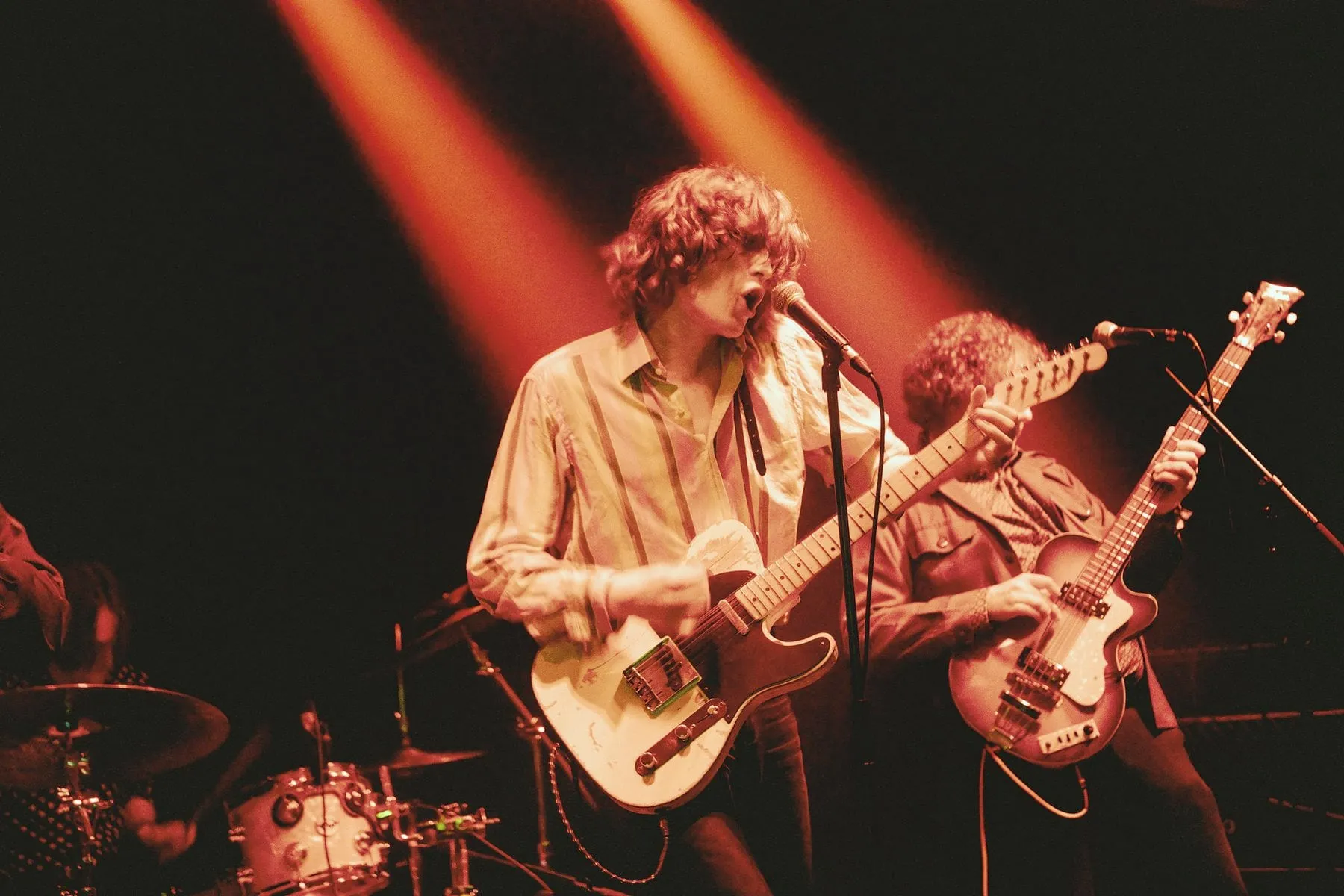
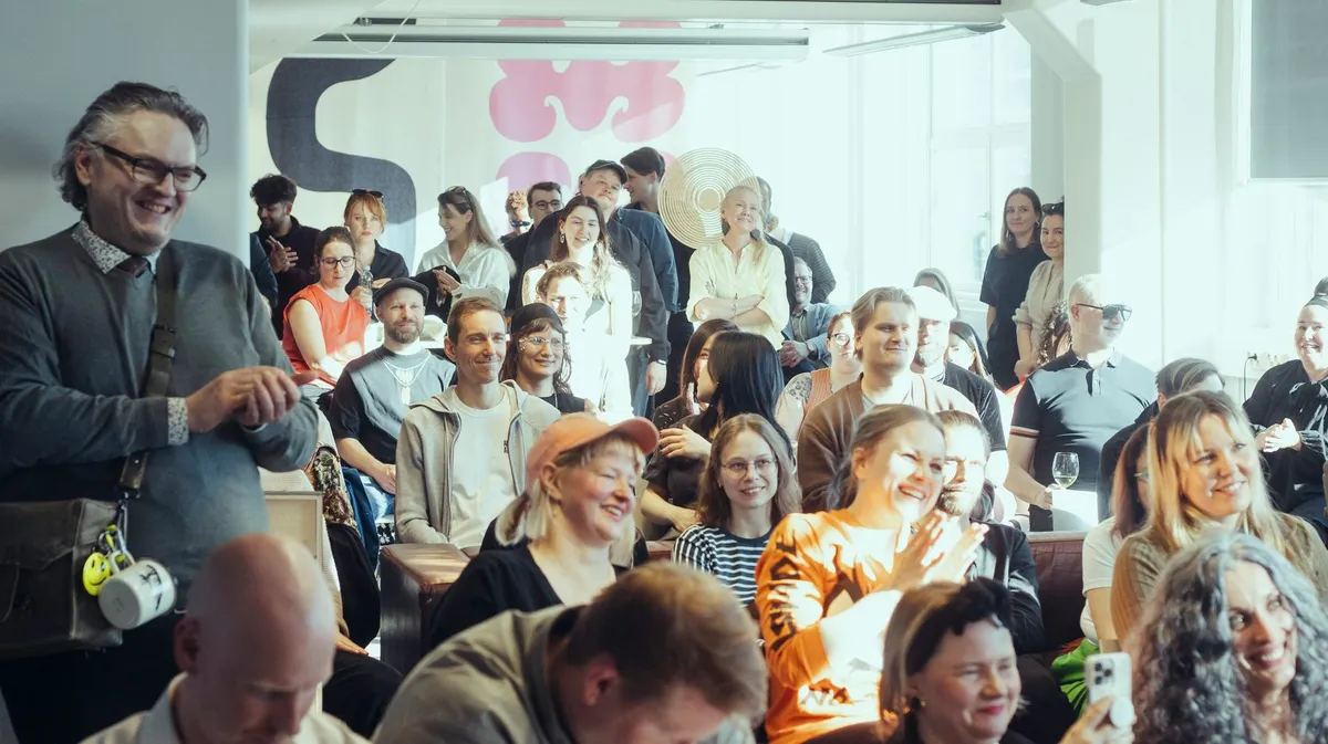
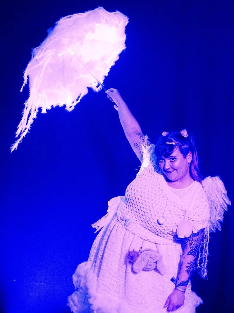
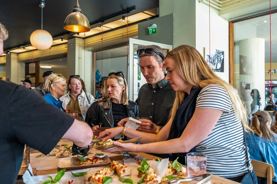
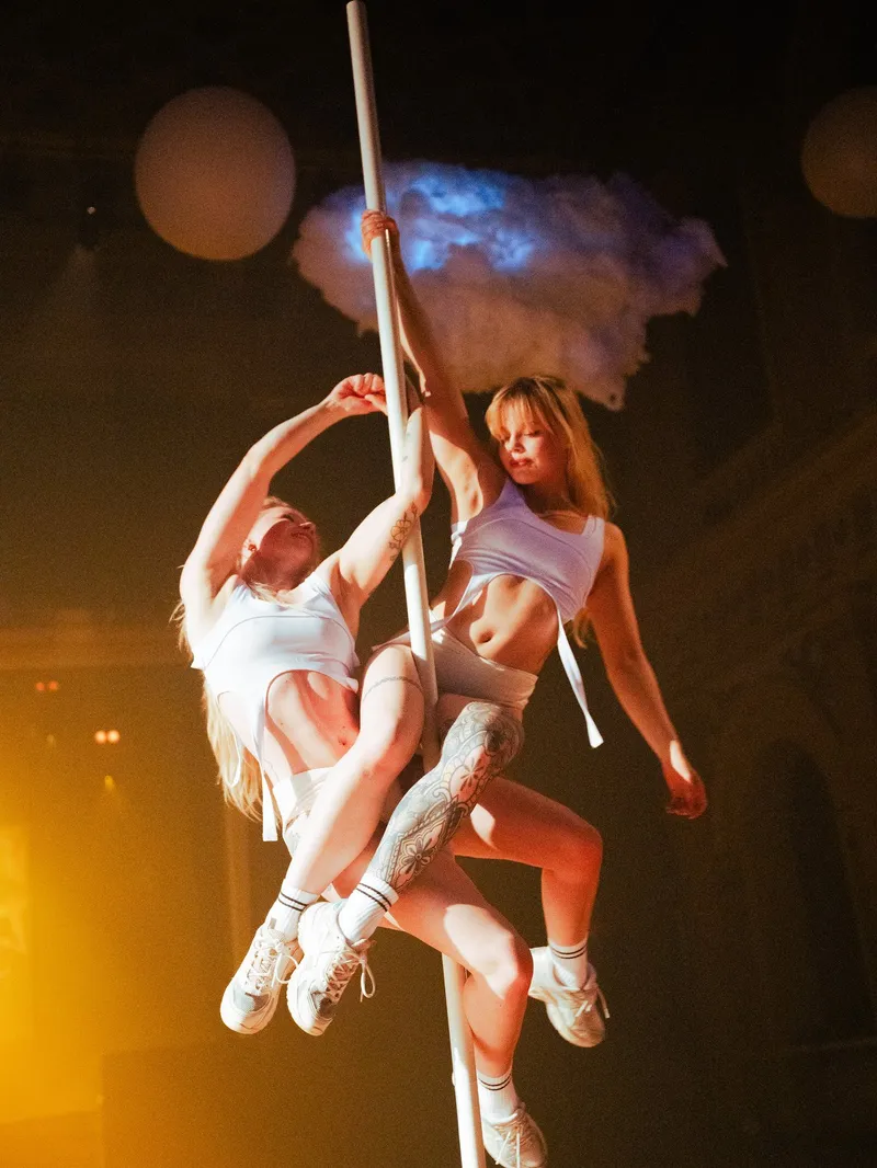
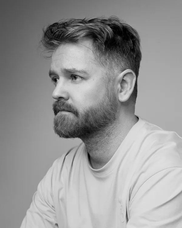
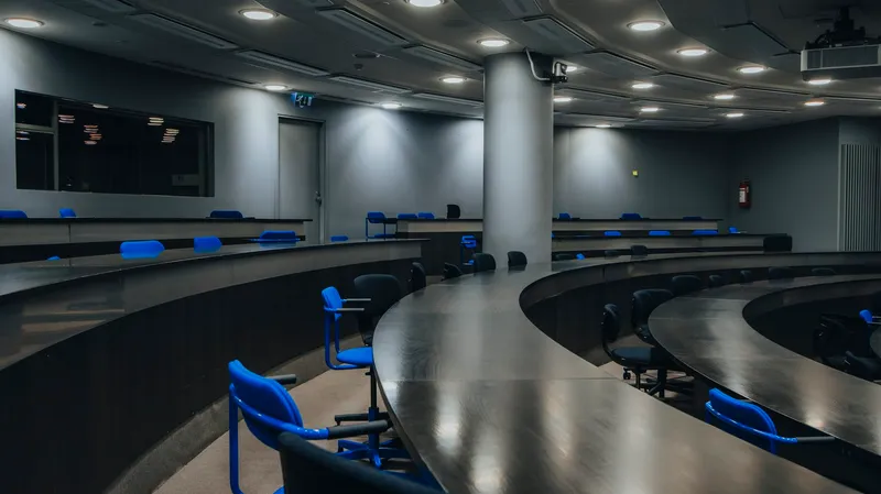
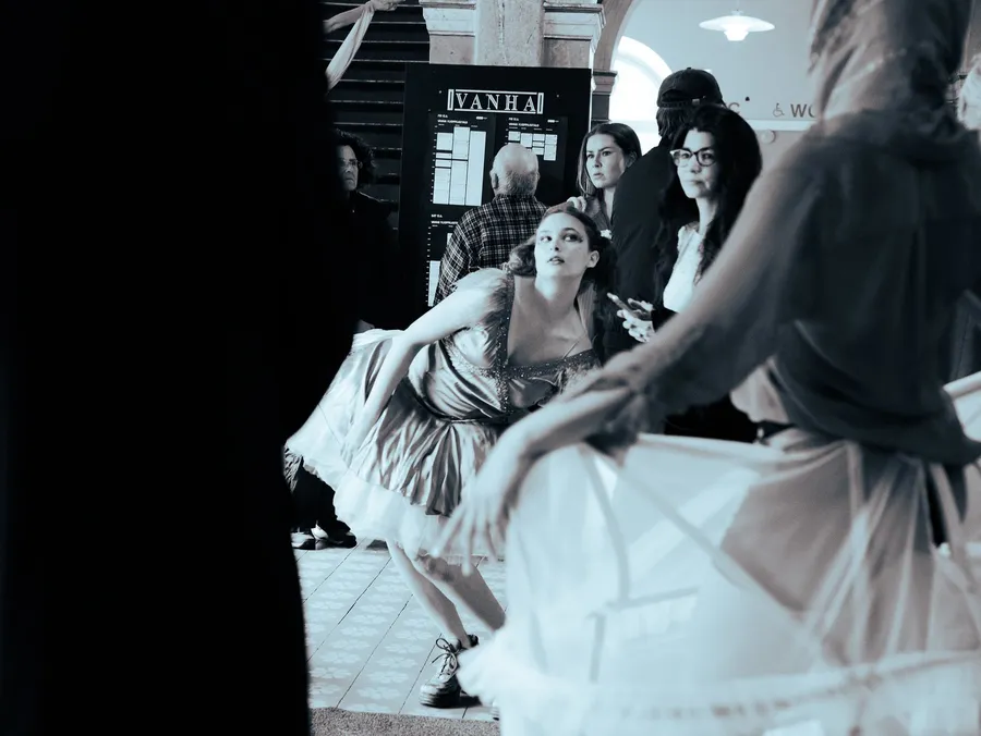
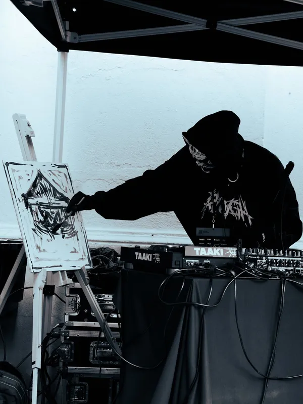
The archive — thousands of photographs from ODDfest, ODDference and ODDspace — is the brand’s strongest asset, and the palette came out of it. Pictures do the work that stock photography and illustration would do in another identity: they prove that a room was full, that the people were real, that somebody made this.
Treatment
- Ratios
- 16:9 film · 2:1 photo break · 4:3 cards · 1:1 mosaic cells · 4:5 and 3:4 portraits. Nothing else.
- Grade
contrast(1.05) saturate(1.15)— a nudge, not a look. Addbrightness(0.8–0.92)only where text sits on the image.- Crop
- To the action: faces, hands, instruments, the crowd. Never letterbox; fill the cell and let the grid crop.
- Corners
- Square. Always.
- Captions
- Small, muted, under the image: what it was, where.
ODDfest 2026 · Vanha Ylioppilastalo. - Credits
- Name the photographer where the archive names them:
Photo: Name. Editorial use is credited “ODDfest / photographer’s name”. - Other people’s logos
- Monochrome in the figure colour, one height, never their brand colours.
Text on a photograph
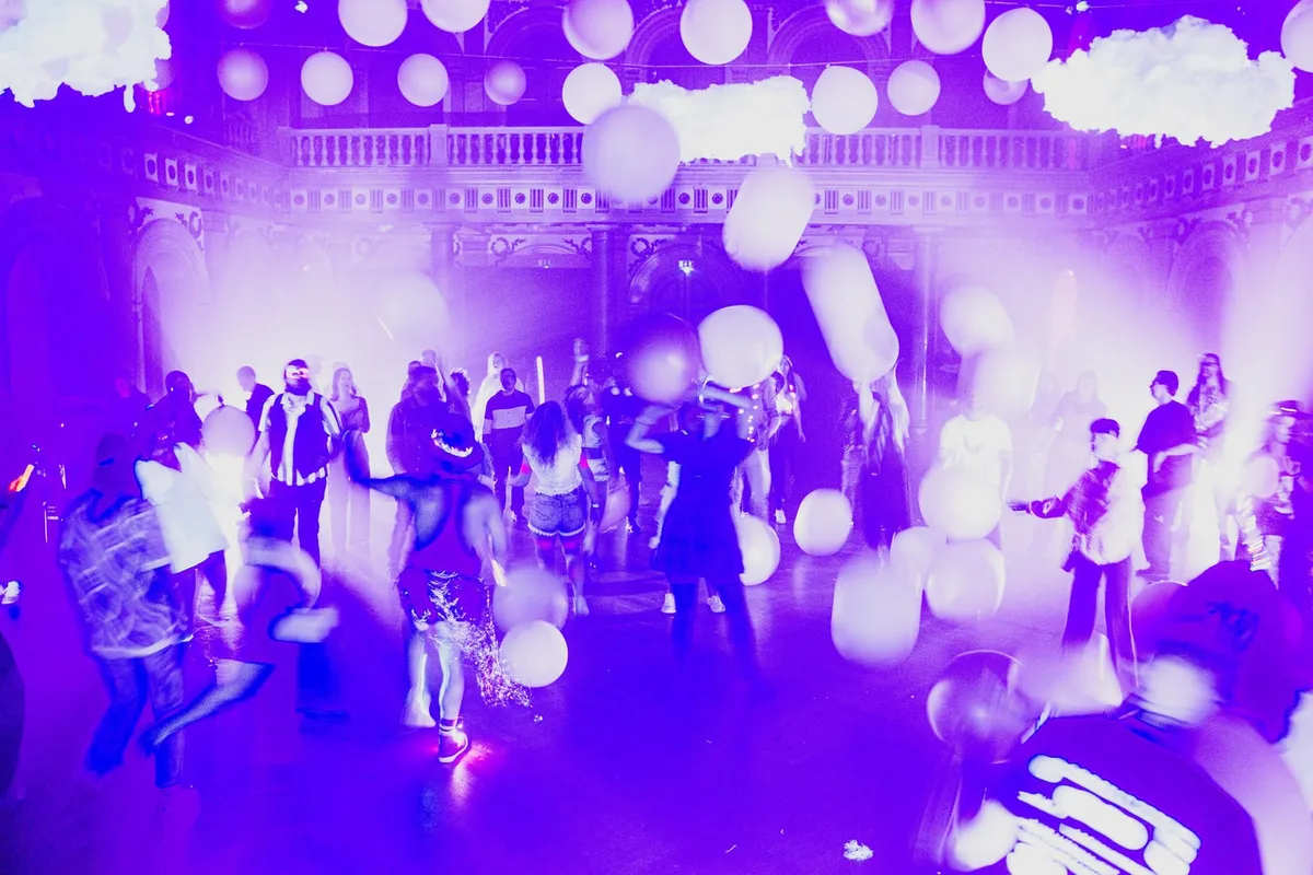
ODDfest 2026 · Vanha Ylioppilastalo
ODDtheatre
Club, theatre and immersive space in one night, with more than ten collectives.
Not ODD
- Stock photography of any kind. Smiling teams at laptops, handshakes, “creative process” flat-lays.
- Generated or composited people, and generated “event” imagery.
- Renders or mock-ups presented as something that happened.
- Heavy filters, duotones, fake film burn, vignettes, drop shadows on photographs.
- Rounded corners, tilted frames, polaroid borders, collage overlays.
- Stage shots with an empty room, unless the emptiness is the subject.
Graphic language
IndexAlmost nothing is drawn. The devices are all made of type, rule and photograph.
Highlights
One week. Many hosts.
Places to work
Reasons to gather
Hover a word.

The whole vocabulary
| Device | Job | Rule |
|---|---|---|
| Hairline | Separates two different things | 1px, rule colour. Never a box around content. |
| Numbered cell | Makes a structure countable | Numbers in Small caps, quiet. Start at 01. |
| Eyebrow | Says what kind of thing follows | Two or three words. Never a sentence. |
| Section head | Opens a section | Centred, with its rule. One per section. |
| Strike | Navigation state | 2.5px through the middle. Nav only. |
| Arrow link | Goes somewhere | Trailing →. Never a button in disguise. |
| Pill | Something you press | Three variants. No fourth without a documented reason. |
| Tag | Labels a thing | Pill shape, raised fill, sentence case, not a link. |
| Voice label | Names the audience | Ember for creative, Signal for business. Creative first. |
| Two-tone headline | Shows the argument | Premise quiet, point full. One size. |
| Rail | Frames a product page | Desktop only. Text, never decoration. |
| Grain | Makes the surface physical | 4.5%, full page, one layer. Never over print. |
| Mark as image | Signs the page | Hero scale, Paper on a photograph, with a scrim. |
Devices ODD does not have
No icon set (only the social glyphs and a chevron), no illustration, no patterns, no badges with coloured fills, no cards with rounded corners or shadows, no dividers with ornaments, no “brand shapes”. If a new device seems necessary, it needs a job that none of the thirteen above can do — and it goes in this table when it ships.
Components
IndexOne button. Three variants, and that is the entire vocabulary.
Events create reasons to gather
ODDfest makes creative activity across Helsinki visible as one shared week.
--space-3 between title and body.Helper text sits under the field, muted, at the Small size.
The site has one more component family worth knowing: the band — a raised, square, full-width block with one keyline in heat, used once per page for the single biggest ask. Everything else (grids, lists, tables, FAQs, pricing) is the numbered cell or the hairline row again, at a different size.
Motion
IndexResponsive, not animated. Everything that moves has a still version.
Motion in this system is either a response — something warms, lifts or leans because you touched it — or ambience: grain, a drifting rail, a photograph slowly panning. It is never a performance the visitor has to sit through, and it is never the thing that makes content appear.
| Token | Value | For |
|---|---|---|
--duration-fast | 0.2s | Hover, colour, small state changes. |
--duration-base | 0.35s | Panels and menus opening. |
--duration-slow | 0.6s | Image fades and crossfades. |
--duration-reveal | 0.7s | Scroll reveal: fade plus a 14px rise. |
--ease-out-expo | cubic-bezier(0.16, 1, 0.3, 1) | Entrances. |
--ease-spring | cubic-bezier(0.34, 1.56, 0.64, 1) | A small overshoot for a physical object. Rare. |
magnetic | cubic-bezier(0.2, 0.9, 0.3, 1) | Magnetic CTA follow. |
Behaviours
- Hover
- Text and rows warm to heat in 0.2s. Outline controls brighten their border. Nothing grows, nothing bounces.
- Press
- On touch, a Pill scales to 0.96 — the only place the system uses a transform on a control.
- Magnetic
- A primary CTA leans a few pixels towards the cursor. One per view, desktop only.
- Cursor
- The hand-drawn arrow's tip never lags. Its wood grain turns with distance travelled and stops when the hand stops; it leans with speed, presses on click, and warms with heat over anything you can act on. Text fields, disabled controls and embeds keep their native cursor.
- Reveal
- A block fades up 14px over 0.7s as it enters. Once, never on exit, never staggered beyond a grid’s own cards.
- Navigation
- The strike draws from the centre out. Panels fade and rise 12px with
--ease-out-expo. - Image
- Archive cells pan slowly and swap on a randomised loop; video fades in over its poster only once playback is confirmed.
- Reduced motion
- Everything above stops. The reveal never attaches, the grain holds still, video is not even downloaded, and the page is identical in content.
Never
- Scroll-jacking, pinned sections, horizontal scroll hijacks, parallax on text.
- Counters that animate a number the reader is trying to read.
- Entrances that depend on JavaScript to make content visible.
- Loops longer than a second on anything a visitor is reading.
- Motion in print, in a PDF, or baked into a deck.
Voice
IndexDirect, warm, a little odd. If another festival could have written it, rewrite it.
Language and type are one decision here. Forta can only shout, so the words it sets have to be short and worth shouting; Gabarito explains, so everything else can be plain. The test for any sentence is whether a real person at ODD would say it out loud to somebody standing in front of them.
- “One shared week, made by Helsinki’s creative communities.”
- “You bring the idea. ODD brings the week together.”
- “An idea still at the notes-on-your-phone stage is a fine thing to send.”
- “Creative work needs more than moments.”
- “You are the heroes of ODD.”
- “Stay ODD.”
- Consultancy: “leveraging cross-sector synergies”.
- Startup: “we’re on a mission to disrupt the creative industry”.
- Grant bureaucracy: “the project aims to facilitate multi-stakeholder engagement”.
- Forced youth: “this one goes hard”, “no cap”.
- Inspirational filler: “we believe in the power of creativity”.
- Adjective stacks: “sharp strategy, bold creativity, real-world execution”.
Rules
- Headlines
- Sentences, ending in a full stop. Questions are welcome. Never a slogan made of fragments, never a pun on “odd” that has to be explained.
- Section titles
- Say what the section is, in the reader’s words: “What ODDfest is”, “How to join”, “Ways to take part.”
- Descriptions
- One idea a sentence. Concrete nouns. Say what a person actually does: work from ODDspace, bring an event, buy a ticket, send a brief.
- CTAs
- Verb first, no more than four words: Submit an event idea, Become a member, Start a conversation. Links that go somewhere take a trailing arrow.
- Events
- Name the venue, the date and who made it. Credit everyone by name, and alphabetically — nobody is a “special guest”.
- Business
- Same voice, different subject. Explain what a company gets in the same plain words: “Connect with people outside your usual circuit.” No case-study jargon, no ROI theatre.
- Honesty
- Say what is not decided: “before the dates are fixed”, “a pilot”, “not on sale yet”. Never publish a figure the site cannot stand behind.
- Spelling
- British English — organisation, centre, colour, programme. Finnish and Swedish names keep their own spelling and diacritics.
Sub-brands
IndexSame system. Different light, different room.
A product page changes four things and nothing else: its ground, its one accent, its hero, and the words in its rails. Everything below the hero — type, spacing, cards, buttons, photography — is identical across the family, which is what lets a visitor land on any of them and know they are in the same organisation.
| Product | Ground | Accent | Hero | Rails | Photographs |
|---|---|---|---|---|---|
| ODDfest | Ink | Ember, plus the Ultraviolet wash | Film, with the lockup over it | ODDFEST · HELSINKI · 2027 | Nights, stages, crowds, the week itself |
| ODDference | Ink | Signal | Film of the room, with the lockup over it | ODDFERENCE · HELSINKI · 2027 | Speakers, audiences, the stage in daylight |
| ODDspace | Paper — the page inverts | None; the inversion is the accent | A mosaic of the rooms | ODDSPACE · VALLILA · YEAR-ROUND | Desks, lunches, talks, the building |
| ODDstudio | Paper | None | A photograph of the room | ODDSTUDIO · VALLILA | Instruments, monitors, the desk |
| Work with ODD / ODDagency | Ink | Signal, sparingly | One photograph, centred title | — | Projects, partners, work in progress |

Helsinki’s creative week, bringing cultural and creative scenes together.
Helsinki · 2027

Where creative expertise meets business and society.
For business

A year-round home for creative work.
Vallila · Helsinki
Applications
IndexThe system leaves the screen. A poster, a post, an invitation, a wall.
In print and in physical space the ladder scales as a whole — set the smallest step first, then keep every ratio. Nothing else changes: Ink or Paper, one hairline, one statement, the archive, and the mark with its clear space.

One week. Many hosts.
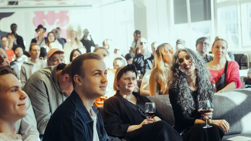

You are invited. ODDference 2027.
- Date
- Place
- Doors
- To be announced
- Helsinki
- 09:00
 Teollisuuskatu 9D
When the thing is not announced yet
- The ask
- No form and no route yet? The ask is
hello@oddfest.co, with a label that says what happens: “Ask us about ODDcity.” Never a button that goes nowhere, never “Coming soon”. - The photograph
- If it has not happened, there is no photograph of it. Borrow a real archive photograph of something adjacent and credit it honestly, or leave the cells empty with their hairlines showing and say in the caption that they are empty on purpose.
- The copy
- Say what is undecided, plainly, in the same voice as everything else.
Rules that travel
- Print type
- Set Small first (9–11pt on A3–A2), then scale the whole ladder by the same ratios. Never enlarge one step alone.
- Margins
- A poster’s margin is the mark’s clear space, at poster scale: half the mark’s height, on every side.
- Print colour
- Ink and Paper are the only grounds. No grain in print — it is a screen texture.
- Social
- 4:5 for feed, 9:16 for stories. Type never sits on the photograph unless a scrim is under it; the caption block carries it instead.
- Physical
- Signage is Forta at whatever size the room needs, with Gabarito for the practical half. One hairline per division.
- Email and documents
- Arial stands in for Gabarito where the font cannot be installed. Forta has no substitute: set the statement as an image or leave it out.
Pitch decks
IndexThe proof that this is a system. Not a website that happens to look nice.
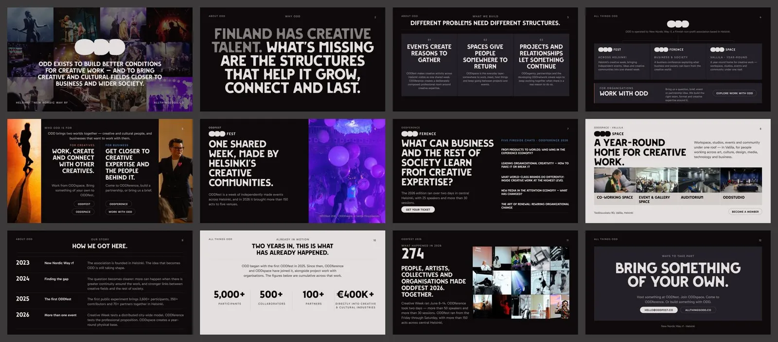
The deck system is the same identity at 13.333 × 7.5 inches: Ink ground, Paper for daylight moments, five type sizes in points, a 12-column grid with a 0.625in margin, hairline cells, archive photography, and pills only where something is a call to action. It is generated from the same tokens as this page, so a slide cannot drift from the site.
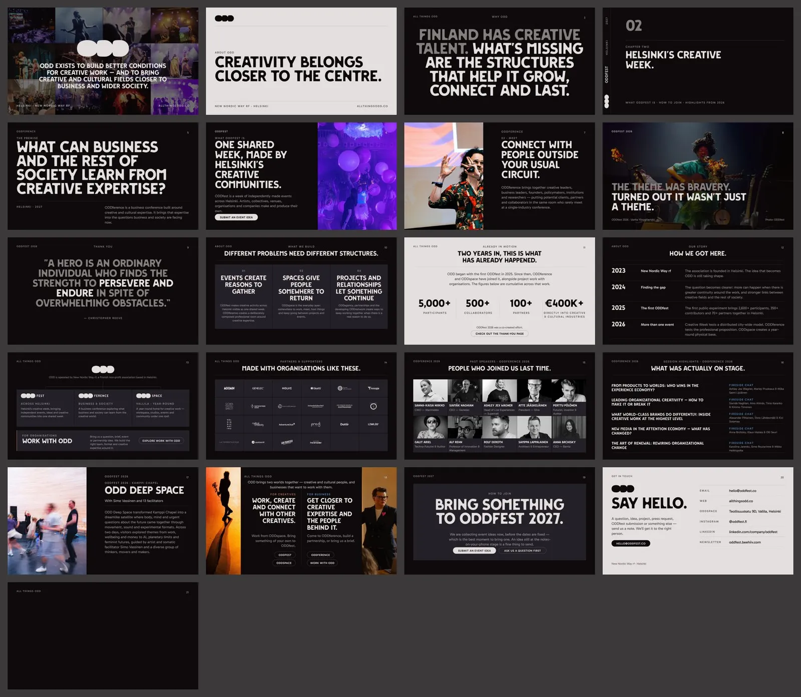
- Template
- 21 archetypes — covers, statements, dividers, text and image, quotes, columns, figures, timeline, ecosystem, partners, people, programme, case study, two sides, closing, contact, and a blank frame. Speaker notes say when to use each.
- Example
- A 12-slide All Things ODD deck built only from real site content, to show the archetypes working together.
- Rebuild
cd brand/deck/src && npm install && npm run build, thennpm run previewfor JPEG previews of every slide.- Fonts
- Install
brand/fonts/*.ttfbefore opening a deck, or PowerPoint will substitute Arial for Forta. - Making a new deck
- Start from the template, delete what you do not need, and keep the archetypes intact. One statement a slide; a slide with two competing headlines is two slides.
Downloads
IndexOne canonical file per thing.
Everything here is generated from this repository, so there is never a second version of a logo floating around a shared drive. Need a lockup that does not exist yet? Add the name tobrand/logos/build.py and run it.
Logos
The mark, every product lockup, and the app icon. Paper artwork for Ink grounds, Ink artwork for Paper. Generated by brand/logos/build.py.
- odd-icon.png
- odd-mark-ink.png
- odd-mark-paper.png
- oddagency-ink.png
- oddagency-paper.png
- oddcity-ink.png
- oddcity-paper.png
- oddference-ink.png
- oddference-paper.png
- oddfest-ink.png
- oddfest-paper.png
- oddspace-ink.png
- oddspace-paper.png
- oddstudio-ink.png
- oddstudio-paper.png
- odd-icon.svg
- odd-mark-ink.svg
- odd-mark-paper.svg
- oddagency-ink.svg
- oddagency-paper.svg
- oddcity-ink.svg
- oddcity-paper.svg
- oddference-ink.svg
- oddference-paper.svg
- oddfest-ink.svg
- oddfest-paper.svg
- oddspace-ink.svg
- oddspace-paper.svg
- oddstudio-ink.svg
- oddstudio-paper.svg
Typefaces
Forta and Gabarito, SIL Open Font Licence 1.1. Install these before opening a deck.
- Forta-Regular.ttf
- Gabarito-Bold.ttf
- Gabarito-Regular.ttf
- Gabarito-SemiBold.ttf
Decks
The 16:9 master template and the example deck, both editable PowerPoint.
- all-things-odd-example.pptx
- all-things-odd-template.pptx
Tokens
Every colour, type role, space, radius and duration as machine-readable JSON, and the same system as one stylesheet for anything built outside this repository — tokens, the type ladder, .wrap/.flow/.section-head/.eyebrow, the base rules and the Pill.
- brand-tokens.json
- odd.css
In the repository
- brand/BRAND-GUIDE.md
- The instruction manual: how to build a new page, campaign, sub-brand or deck so it comes out ODD. Written for a person or an AI agent.
- brand/AUDIT.md
- What the audit found, what was standardised, and what was deliberately left alone.
- brand/CHANGELOG.md
- Every change this system made to the site, and why.
- brand/logos/build.py
- The lockup generator. The only correct way to make a new one.
Do / Don’t
IndexTen decisions that keep it ODD.
| Do | Don’t |
|---|---|
| Set a headline as one sentence in Forta, ending in a full stop. | Stack fragments into a slogan, or type it in capitals. |
| Put an accent where it is light: a label, a keyline, a wash, a hover. | Fill a section, a card or a button with Ember or Signal. |
| Show a real photograph from the archive, credited. | Reach for stock, a render, or a generated crowd. |
| Separate things with a 1px hairline. | Draw a box, a shadow or a rounded card around them. |
| Use the pill shape for buttons, tags and badges. | Round a photograph, a card or a section. |
| Let the parent own the space between blocks. | Add a margin to a component, then claw it back with a negative one. |
| Number a structure: 01, 02, 03. | Add icons to make a list look designed. |
| Put the creative side first when both are shown. | Open with the business case on a creative page. |
| Generate a new lockup with the script. | Draw a new logo, or set a product name in another face. |
| Write what is actually true, including what is undecided. | Publish a figure the site cannot stand behind. |
When a rule here and a live page disagree, the page wins and this line is a bug — but check the page against chapters 02 and 03 first. The system is allowed to change; it is not allowed to drift.
Design tokens
IndexThe book is documentation. The tokens are the system.
src/styles/tokens.css and typography.css are canonical for anything on the web. brand/tokens/brand-tokens.json mirrors them for everything that is not — decks, print, Figma, an agent writing a new page — and npm run check:brand fails the build if the two ever disagree. Every table in this chapter is rendered from that JSON.
Using them
.card {
  background: var(--color-backstage);   /* raised surface  */
  border: 1px solid var(--color-paper-12); /* hairline     */
  padding: var(--space-6);
}
.card h3 {
  font: var(--text-heading);            /* one of five     */
  letter-spacing: var(--tracking-heading);
}
.card p {
  margin-block-start: var(--space-3);   /* title -> body   */
  color: var(--color-paper-60);
}
.card a:hover {
  color: var(--color-heat);             /* warms on touch  */
}
Every token
| Group | Token | Value |
|---|---|---|
| Colour | --swatch-ink | #0E090B |
| Colour | --swatch-paper | #E2DFDE |
| Colour | --swatch-backstage-dark | #232028 |
| Colour | --swatch-backstage-light | #D3CDC9 |
| Colour | --color-amber | #9A432B |
| Colour | --color-amber-bright | #AE6855 |
| Colour | --color-signal | #507AAF |
| Colour | --color-signal-bright | #5081B3 |
| Colour | --color-signal-deep | #40618C |
| Colour | --color-clay | #89706B |
| Colour | --color-clay-read | #967E79 |
| Colour | --color-clay-read (under .theme-light) | #6B5551 |
| Colour | --color-indigo | #1C2B66 |
| Colour | --color-ultraviolet | #8224D4 |
| Ramp (Ink) | --color-paper-12 | rgb(226 223 222 / 12%) |
| Ramp (Ink) | --color-paper-20 | rgb(226 223 222 / 20%) |
| Ramp (Ink) | --color-paper-35 | rgb(226 223 222 / 35%) |
| Ramp (Ink) | --color-paper-40 | rgb(226 223 222 / 55%) |
| Ramp (Ink) | --color-paper-60 | rgb(226 223 222 / 60%) |
| Ramp (Ink) | --color-paper-80 | rgb(226 223 222 / 80%) |
| Ramp (Ink) | --color-paper-06 | rgb(226 223 222 / 6%) |
| Ramp (Ink) | --color-paper-03 | rgb(226 223 222 / 3%) |
| Ramp (Paper) | --color-ink-12 | rgb(14 9 11 / 12%) |
| Ramp (Paper) | --color-ink-20 | rgb(14 9 11 / 20%) |
| Ramp (Paper) | --color-ink-35 | rgb(14 9 11 / 35%) |
| Ramp (Paper) | --color-ink-40 | rgb(14 9 11 / 62%) |
| Ramp (Paper) | --color-ink-60 | rgb(14 9 11 / 70%) |
| Ramp (Paper) | --color-ink-80 | rgb(14 9 11 / 80%) |
| Ramp (Paper) | --color-ink-06 | rgb(14 9 11 / 6%) |
| Ramp (Paper) | --color-ink-03 | rgb(14 9 11 / 3%) |
| Type | --text-hero | clamp(3.25rem, 6vw, 5.25rem) / 0.98 / -0.02em |
| Type | --text-display | clamp(2.125rem, 4vw, 3.25rem) / 1.04 / -0.015em |
| Type | --text-heading | clamp(1.5rem, 2.4vw, 2rem) / 1.12 / -0.01em |
| Type | --text-body | clamp(1rem, calc(0.96rem + 0.2vw), 1.0625rem) / 1.55 / normal |
| Type | --text-small | 0.875rem / 1.4 / normal |
| Space | --space-1 | 0.25rem |
| Space | --space-2 | 0.5rem |
| Space | --space-3 | 0.75rem |
| Space | --space-4 | 1rem |
| Space | --space-5 | 1.25rem |
| Space | --space-6 | 1.5rem |
| Space | --space-8 | 2rem |
| Space | --space-10 | 2.5rem |
| Space | --space-12 | 3rem |
| Space | --space-16 | 4rem |
| Space | --space-20 | 5rem |
| Space | --space-24 | 6rem |
| Space | --space-32 | 8rem |
| Rhythm | --space-grid | clamp(1rem, 0.6rem + 1.25vw, 1.75rem) |
| Rhythm | --space-content | clamp(1.5rem, 1rem + 1.25vw, 2rem) |
| Rhythm | --space-group | clamp(2rem, 1.4rem + 1.6vw, 3rem) |
| Rhythm | --space-section | clamp(3rem, 2.4rem + 2.5vw, 4rem) |
| Radius | — | 0 |
| Radius | --radius-panel | 10px |
| Radius | --radius-pill | 999px |
| Motion | --duration-fast | 0.2s |
| Motion | --duration-base | 0.35s |
| Motion | --duration-slow | 0.6s |
| Motion | --duration-reveal | 0.7s |
| Easing | --ease-out-expo | cubic-bezier(0.16, 1, 0.3, 1) |
| Easing | --ease-spring | cubic-bezier(0.34, 1.56, 0.64, 1) |
| Easing | magnetic | cubic-bezier(0.2, 0.9, 0.3, 1) |